Opens in a new tab.
Skip to content

Nate Mills

Senior Product Designer, Design Systems

This portfolio is interactive. See the live version:

natemills.me

About Work Roles Testimonials Training Awards
Colour Type Icons Space Edges Elevation Motion Layout Glass Components
Design system
Get in touch
Design system

Designed to shipship

Automated systems, tokens & governance.
The machinery behind the products.
Automated systems, tokens & governance.
The machinery behind the products.

CONNECT ONLinkedIn (opens in a new tab) PLUGINS ONFigma (opens in a new tab) VIEW CODE ONGitHub (opens in a new tab)
WCAG2.2 AA

Senior product designer, design systems consultantdesign systems consultant

Design systems people actually use Figma to code, no handoff theatre Tokens doing the heavy lifting Governance you don’t babysit WCAG 2.2 AA, not bolted on 20 years, still curious Design systems people actually use Figma to code, no handoff theatre Tokens doing the heavy lifting Governance you don’t babysit WCAG 2.2 AA, not bolted on 20 years, still curious Design systems people actually use Figma to code, no handoff theatre Tokens doing the heavy lifting Governance you don’t babysit WCAG 2.2 AA, not bolted on 20 years, still curious

Brands I’ve worked with, plus tools and standards I use.

Brands I’ve worked with

Bupa Australia Virgin Australia Toronto General Hospital, University Health Network HCF Australia Disney Velocity, Virgin Australia loyalty Healthcare Human Factors Nike Taco Bell Sick Kids Hospital, Toronto Sony BMW IBM Salomon Google

Tools & platforms

Training & standards

W3C

Senior product designer with a systems brain

From industrial design to design systems:
graphic, UX, and UI in between.

I’ve designed medical equipment, flight apps, and the design systems behind them. Different industries, same instinct: make the complicated feel obvious.

The connective tissue under the product: tokens, governance, automation, accessibility from day one.

If your system is outpacing your team, let’s talk.

Top skills and tools

01

Design systems

Building the components is the easy bit. The hard part is everything around them: tokens that do not fall over the moment the brand changes, docs good enough that nobody has to come and find me, and a way in for contributors that still works when I am not there. That is where the time goes. These are what I reach for most, not the whole stack.

FigmaLibrary audits and components
Style DictionaryOne source, every platform
zeroheightDocs the whole team reads
StorybookComponents engineers browse
Tokens StudioToken authoring and themes
02

Accessibility

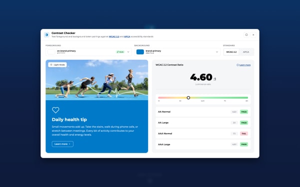
I would rather get it right once than fix it forty times. So contrast, focus, tap targets and motion all get decided in the tokens, which means you cannot really build an inaccessible component by accident. Then machines check it on every release, because I will miss something eventually and they will not.

W3C WCAGThe 2.2 AA standard
GoogleLearn Accessibility and Lighthouse
MicrosoftAccessibility Fundamentals
UniSCInclusive Digital Design
03

AI, vibe coding

AI is best at the parts of the job that were never really the craft. I use it to try ten visual directions in an afternoon, to make the twentieth variant of an asset nobody wants to make by hand, and to build and stress test what I design. The taste is still mine. That was always the fun part anyway.

MidjourneyConcept exploration and mood
Figma WeaveAsset variants at scale
Nano Banana ProComposites with real typography
ClaudeWhere I build and review
04

Automation

Every design team has someone quietly redoing the same job every Tuesday. It almost never needs to be a person. Build the thing once and intake, triage and reporting look after themselves. Microsoft is where I have gone deepest, but it works the same on Adobe or Atlassian. You get hours back, and hours are where the good work happens.

Power AutomateWorkflow automation at scale
Azure DevOpsRequests become tracked work
SharePointDocumentation and governance
Power BISystem health reporting
GitHub ActionsGates on every commit
PlaywrightAccessibility and visual checks

Work

1 / 3

Roles

  1. Bupa

    2025 - 2026

    Design Systems Consultant

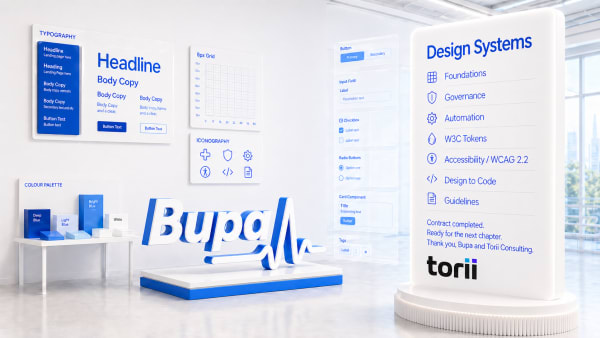
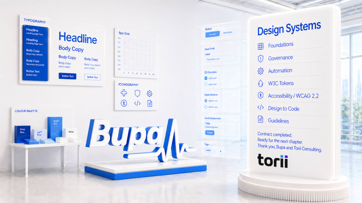
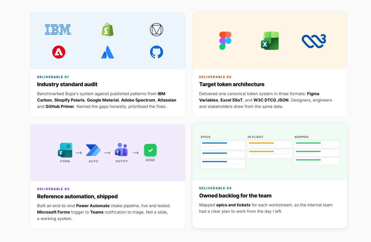
    A design system serving three brands (Bupa, Blua, Mindplace) across web, iOS and Android, with more libraries than anyone could name and requests arriving through eight different doors. Classic case of solving the same problems twice. So:

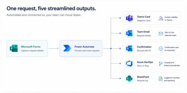
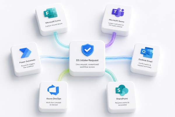
    • One front door replaced eight, 18 hours of triage handed back
    • 131 Figma libraries audited, 80+ shadow libraries unpublished
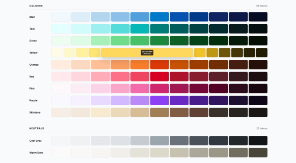
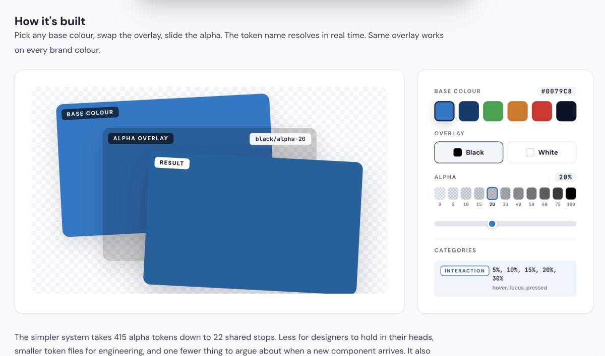
    • 1,714 tokens consolidated to 450, one architecture for three brands
    • 45+ item governance roadmap, stories ready for engineering to run
    bupa.com.au, opens in a new tab
    Bupa Design System overview: the seven disciplines I led.Design System Intake Request flow: Microsoft Forms to Power Automate to five Microsoft 365 services. One pipeline replacing scattered ad-hoc requests.Colour token primitives: 10 hue ramps and the foundation of the consolidated 450-token system.Design System Analytics dashboard concept: 247 components at 84% adoption. Built to make adoption visible to leadership.Six months, measured: token library cut from 1,714 to 450 (74% reduction) at parity coverage.Token Explorer: searchable dashboard for browsing the consolidated tokens across primitive and semantic tiers.Design System Intake Request: one form, automated routing into Microsoft 365. Killed the manual triage queue.Contrast Checker: live AA/AAA pairings tool so contributors never ship an inaccessible colour combination.Bupa Design System overview: the seven disciplines I led.Design System Intake Request flow: Microsoft Forms to Power Automate to five Microsoft 365 services. One pipeline replacing scattered ad-hoc requests.Colour token primitives: 10 hue ramps and the foundation of the consolidated 450-token system.Design System Analytics dashboard concept: 247 components at 84% adoption. Built to make adoption visible to leadership.Six months, measured: token library cut from 1,714 to 450 (74% reduction) at parity coverage.Token Explorer: searchable dashboard for browsing the consolidated tokens across primitive and semantic tiers.Design System Intake Request: one form, automated routing into Microsoft 365. Killed the manual triage queue.Contrast Checker: live AA/AAA pairings tool so contributors never ship an inaccessible colour combination.
  2. Virgin Australia

    2023 - 2025

    Design Systems Lead

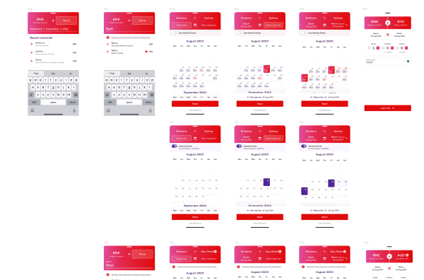
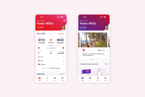
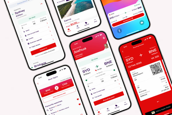
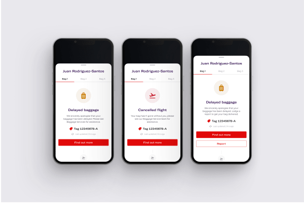
    Joined the app team on a one-year contract to redesign the native flight booking experience for iOS and Android. The redesign contributed a 3.6% lift worth $1.7M, part of $4M+ across squad tests.

    Then led the design system behind both Virgin Australia and Velocity Frequent Flyer: two brands, one system, seven squads, 150+ people shipping across web, iOS and Android.

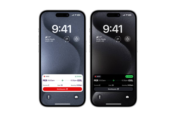
    • Built a real-time flight journey tracker, a first for Australian aviation
    • Consolidated scattered libraries into one place teams could actually find things
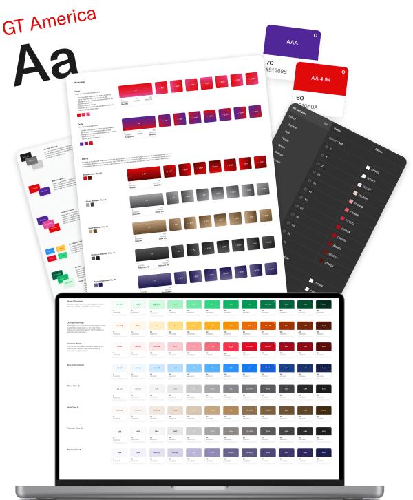
    • Simplified the colour system and tokens: back to basics first, then build up
    • Governance processes and contribution models that gave the system a spine
    • Accessibility (WCAG 2.2 AA) embedded in the foundation layer, not bolted on at review
    virginaustralia.com, opens in a new tab
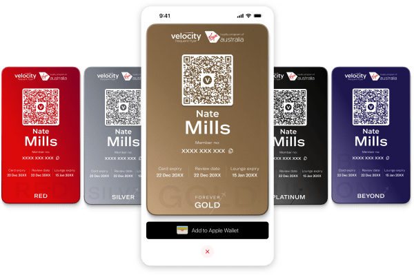
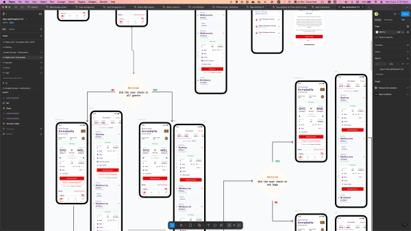
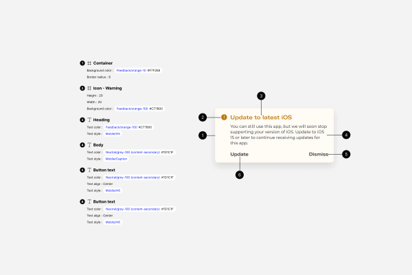
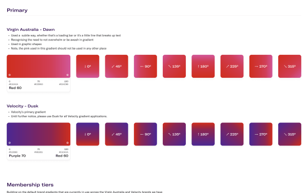
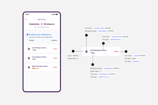
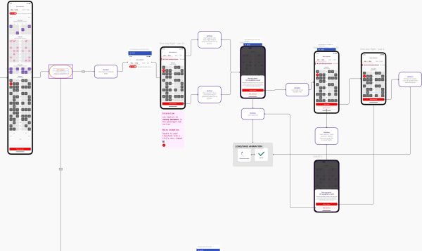
    Virgin Australia Apple Watch app: app store listing, watch app grid, and a real-time bag-tracking notification.Virgin Australia app: long-form mock sheet covering booking, check-in, and trip management flows.Virgin Australia design system: colour token sheets and the palette explorer.Virgin Australia app: checkout flow built on the unified VA + Velocity component library.Virgin Australia app: live-activity lock screen widgets tracking a flight in real time.Virgin Australia Velocity app: digital membership cards across the Red to Beyond tiers, with an add to Apple Wallet action.Virgin Australia app: flight search and booking screens showing the redesigned flow.Virgin Australia app: real-time bag tracking feature screen.Virgin Australia foundations: the type ramp and colour tokens every component inherits.Check-in flow in Figma: decision logic and trip screens on shared components.Virgin Australia and Velocity: foundations, components, and shipped screens under one system.Component annotations: every colour and type style pinned to a token for engineering handoff.Brand gradient foundations: Virgin's Dawn and Velocity's Dusk, documented by angle and usage rule.Virgin Australia component annotations: spec callouts authored for engineering handoff.Seat-selection flow: every state and interaction note, built from system components.Virgin Australia Apple Watch app: app store listing, watch app grid, and a real-time bag-tracking notification.Virgin Australia app: long-form mock sheet covering booking, check-in, and trip management flows.Virgin Australia design system: colour token sheets and the palette explorer.Virgin Australia app: checkout flow built on the unified VA + Velocity component library.Virgin Australia app: live-activity lock screen widgets tracking a flight in real time.Virgin Australia Velocity app: digital membership cards across the Red to Beyond tiers, with an add to Apple Wallet action.Virgin Australia app: flight search and booking screens showing the redesigned flow.Virgin Australia app: real-time bag tracking feature screen.Virgin Australia foundations: the type ramp and colour tokens every component inherits.Check-in flow in Figma: decision logic and trip screens on shared components.Virgin Australia and Velocity: foundations, components, and shipped screens under one system.Component annotations: every colour and type style pinned to a token for engineering handoff.Brand gradient foundations: Virgin's Dawn and Velocity's Dusk, documented by angle and usage rule.Virgin Australia component annotations: spec callouts authored for engineering handoff.Seat-selection flow: every state and interaction note, built from system components.
  3. HCF Australia

    2023

    Senior UI Designer

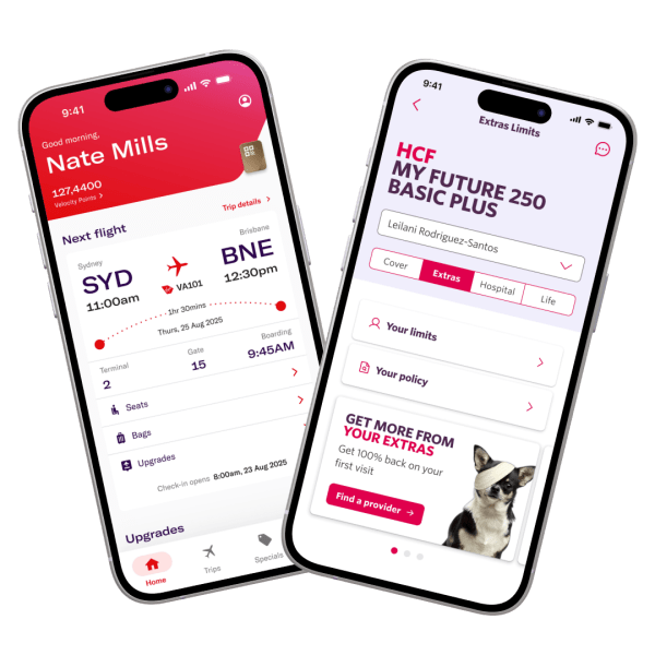
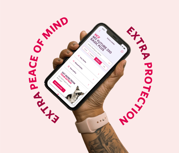
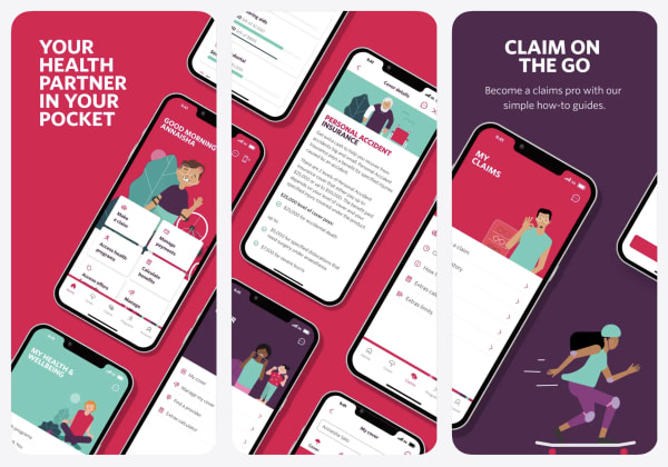
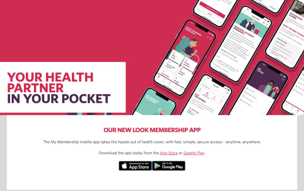
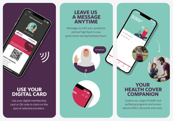
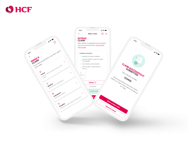
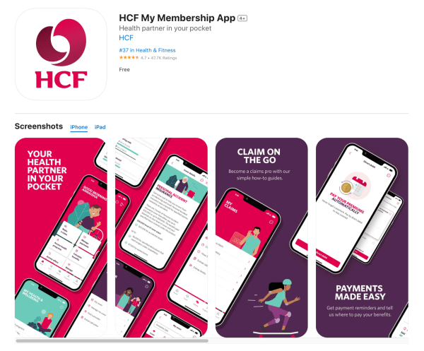
    Brought in for the ground-up rebuild of the My Membership app. HCF scrapped the old app and started fresh: a white-label foundation, a small team, and a six-month runway from UX through to delivery.

    • Turned the white-label foundation into HCF’s own design system in Figma
    • UI screens at pace beside a small UX team, on a compressed timeline
    • A rebuild from zero rather than a retrofit, rare in Australian health insurance
    • The app now holds 4.7 stars from 59,000+ App Store ratings
    hcf.com.au, opens in a new tab
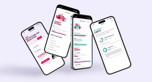
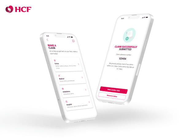
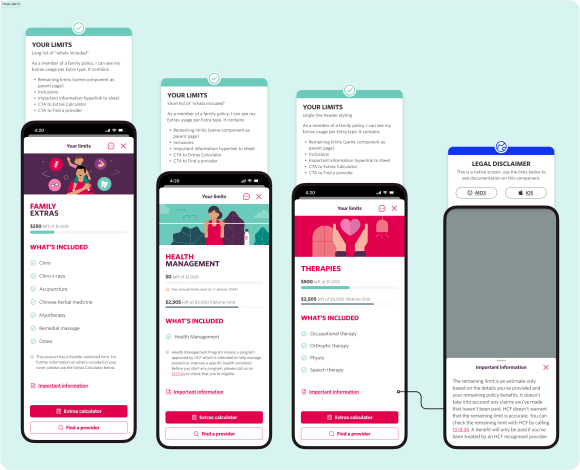
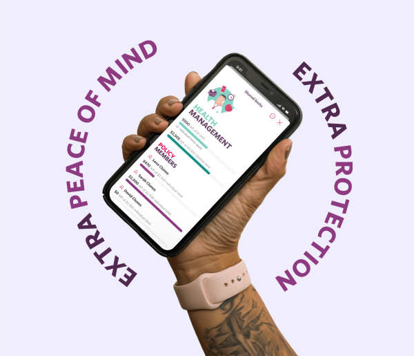
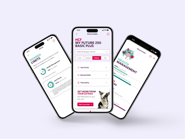
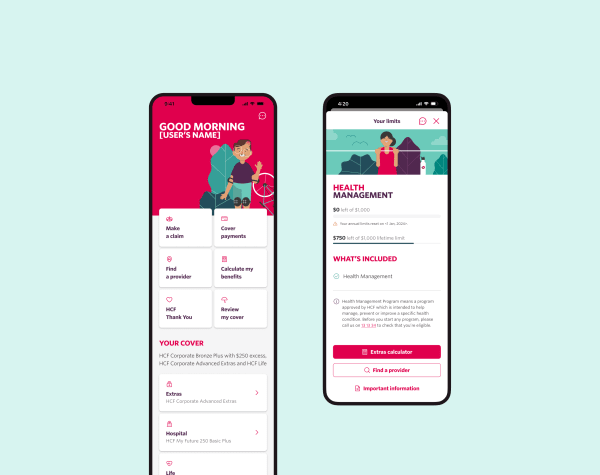
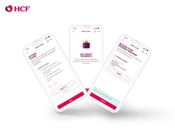
    HCF mobile: member detail screen for plan and ID management.HCF: claims and benefits card layouts used across the member portal.HCF: home and dashboard, the member entry point to claims, benefits, and limits.HCF: benefits limits tracker. Members see what they've used and what remains across categories.HCF mobile: member detail screen for plan and ID management.HCF: claims and benefits card layouts used across the member portal.HCF: home and dashboard, the member entry point to claims, benefits, and limits.HCF: benefits limits tracker. Members see what they've used and what remains across categories.
  4. Healthcare Human Factors

    2014 - 2022

    UX / UI Designer

    Eight years designing medical technology where a confusing interface can actually hurt someone. Healthcare Human Factors is the world’s largest human factors team dedicated to healthcare, embedded at Toronto General Hospital (UHN), ranked the No.2 hospital in the world. The brief is simple: design the preventable errors out.

    • Started in industrial design, working on medical equipment alongside clinicians and nurses
    • That hands-on clinical work pulled me into UX, then UI, then systems thinking across dozens of apps
    • Healthcare compliance shaped how I approach governance and accessibility today
    • Built software with teams from Google Health, Apple, and IBM
    • W3B Award winner, Best in Healthcare. Qualcomm Tricorder XPRIZE, Bold Epic Innovator
    humanfactors.ca, opens in a new tab
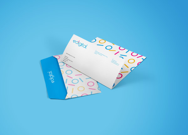
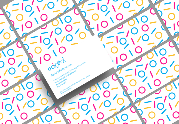
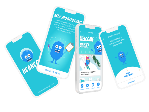
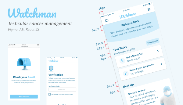
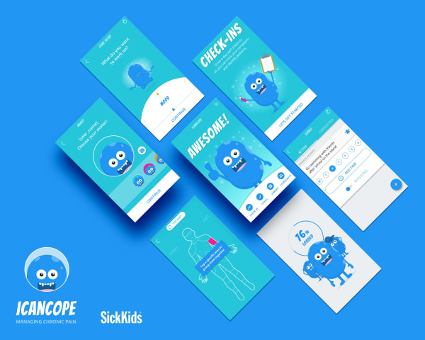
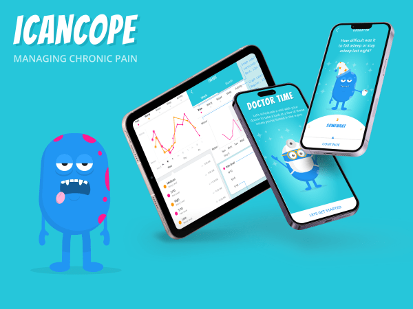
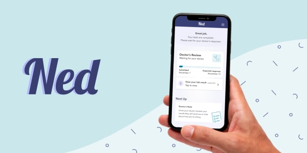
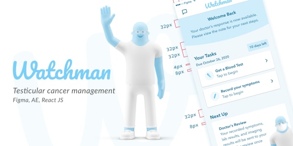
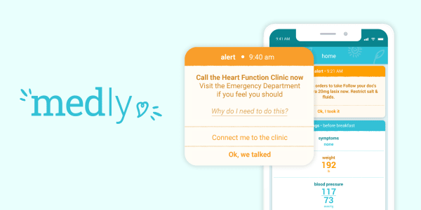
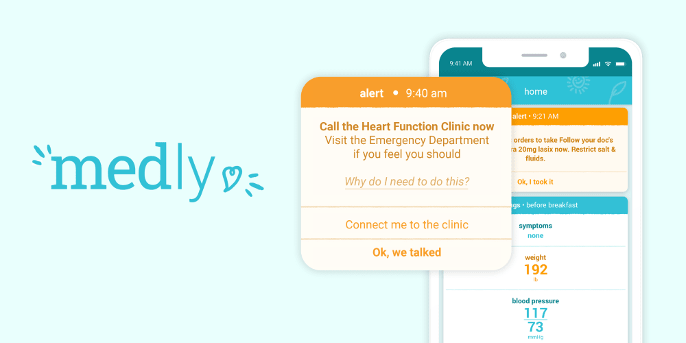
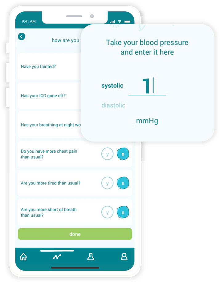
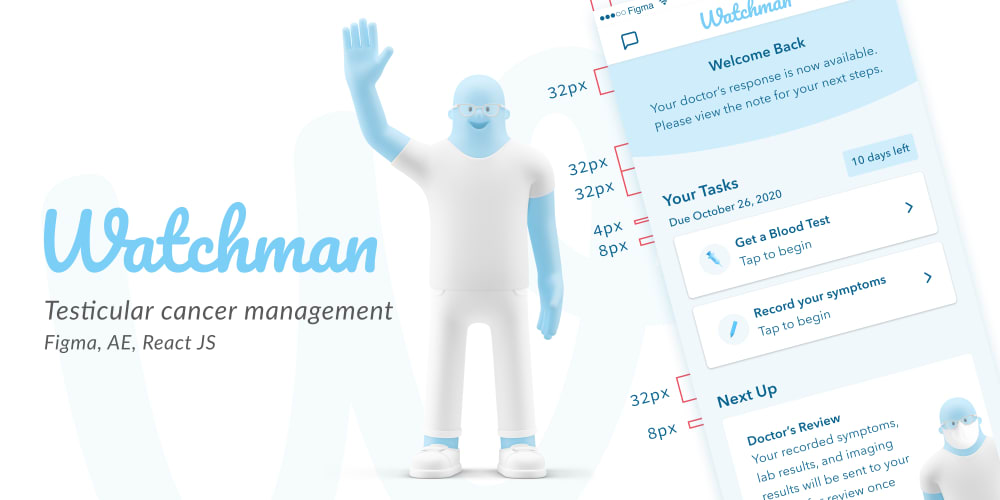
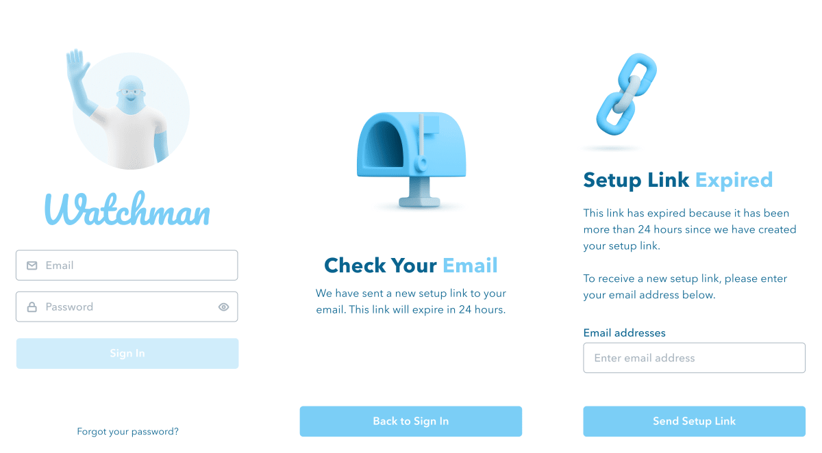
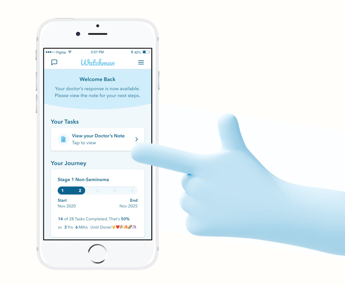
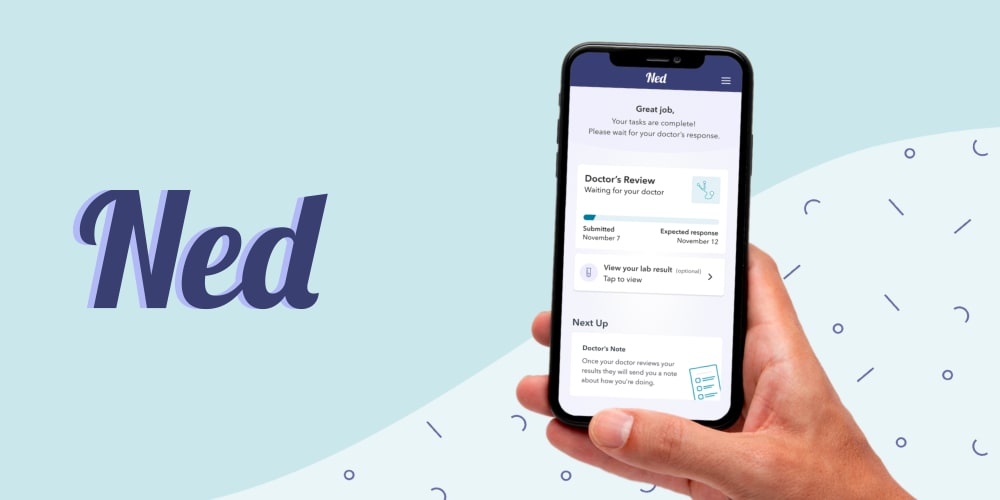
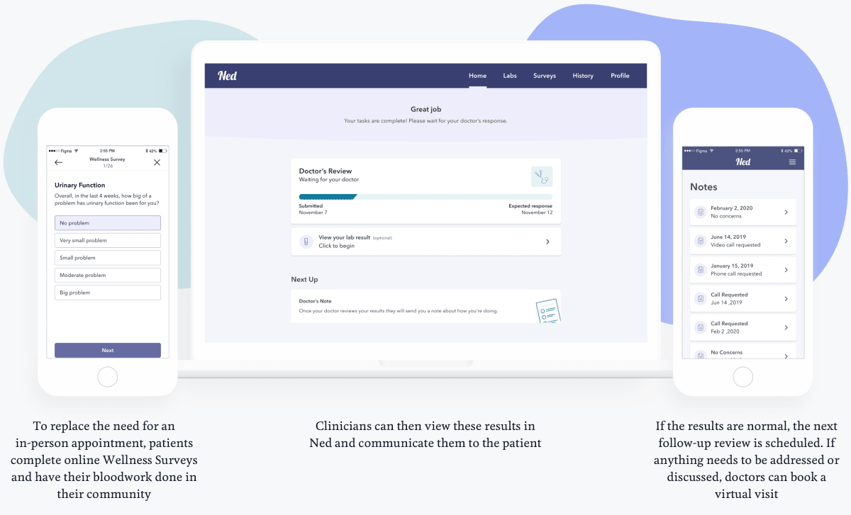
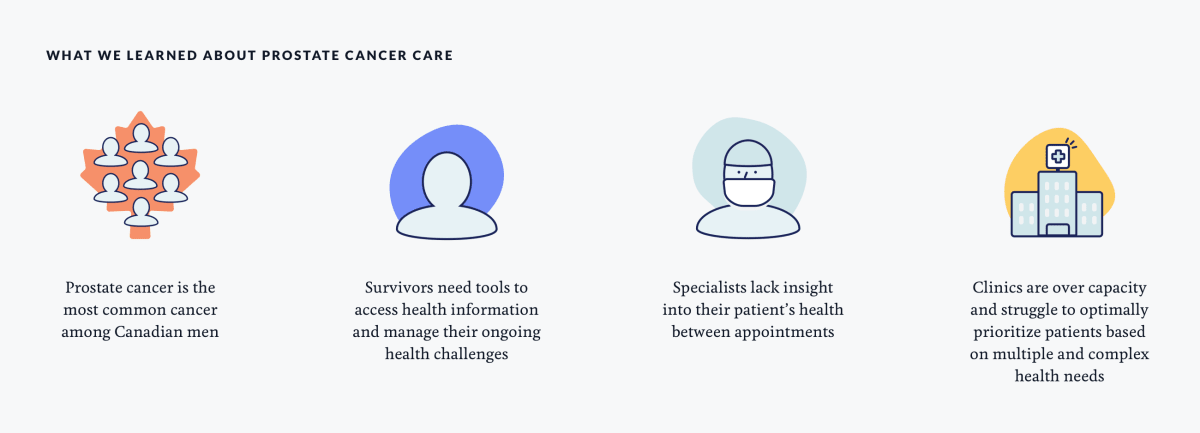
    UHN Digital: brand identity stationery, carrying the binary-confetti pattern I designed.UCAN: clinician dashboard tracking patient trends and methotrexate-monitoring data.UHN Digital: business-card system built on the brand identity I designed.UCAN: patient mobile app for paediatric methotrexate monitoring and symptom check-ins.Watchman testicular-cancer survivorship app, screen design.iCanCope: SickKids chronic-pain app, mood check-ins and rewards with the monster mascot.iCanCope: SickKids chronic-pain self-management app, key screens.NED patient engagement app, screen and interface design.Watchman testicular-cancer survivorship app, project overview.Medly heart-failure app, patient alert and clinician dashboard.UHN Digital: brand identity stationery, carrying the binary-confetti pattern I designed.UCAN: clinician dashboard tracking patient trends and methotrexate-monitoring data.UHN Digital: business-card system built on the brand identity I designed.UCAN: patient mobile app for paediatric methotrexate monitoring and symptom check-ins.Watchman testicular-cancer survivorship app, screen design.iCanCope: SickKids chronic-pain app, mood check-ins and rewards with the monster mascot.iCanCope: SickKids chronic-pain self-management app, key screens.NED patient engagement app, screen and interface design.Watchman testicular-cancer survivorship app, project overview.Medly heart-failure app, patient alert and clinician dashboard.
  5. Earlier career

    2005 - 2014

    Product Designer

    One role to cover the early years. Industrial design came first, and it taught me how things actually get made. Agency years in Munich and Toronto added motion, web, brand and print for Audi, BMW, Sony, Red Bull and Taco Bell, and taught me pace and range.

    The bridge to now was University Health Network, the No.2 hospital in the world, where prototyping medical equipment beside clinicians pulled me from hardware into UX and UI. 20 years, five disciplines, three continents: the judgment to know which rules matter, which can bend, and how to make good design easy to ship.

Kind words

“

Benson Low

Product, Design and Research Lead

Worked closely with Nate on a design system audit, and he delivered exactly what you want from someone in that space: clarity, rigour, and practical impact.

What stood out was his ability to translate complex environments into clear, actionable recommendations. Not just critique, but a path forward that teams can actually implement.

If you need someone to assess, stabilise, or evolve a design system with real-world constraints in mind, Nate is a solid choice.

Bupa

LinkedIn
“

Akib Uddin

Product Manager

Nathan always showed a clear passion for building the right products for the right users. Over the years, I have worked with him on multiple product teams and in each one, Nathan demonstrated a deep understanding of the problem and produced creative designs to meet the needs.

He is able to deliver on tight timelines, works well in a team and responds well to feedback. I enjoyed working with Nathan and look forward to seeing what he creates next.

Google

LinkedIn
“

Alex Plummer

General Manager

Nathan has done great work in Virgin Australia’s Digital Design team as a Senior UI Designer; establishing the foundation for our design system, reworking design creation processes that streamlined our workflow and applying a much-needed technical framework to drive consistency and high-quality design across our channels.

I appreciate his no-nonsense approach and clear communication style. You can rely on him to tackle complex design challenges and deliver practical solutions.

Virgin Australia

LinkedIn
“

Joseph Cafazzo

Executive Director

Nate is a joy to work with. He would be my go-to designer when I sought exceptional creativity. He is so good at looking at all of our design inputs and synthesizing them into prototypes, and then on to realizing them fully.

His designs for our work at SickKids are still relevant and thriving, years after he conceived them. I have nothing but praise for Nate as an exceptional design colleague.

Healthcare Human Factors

Toronto General Hospital

LinkedIn
“

Dan Fischer

Head of Design

I’ve had the pleasure of working with Nathan as he has played a key role in advancing our design system. He brought a sharp creative eye and strong attention to detail that consistently elevated the quality and consistency of our design work.

His contributions helped us lay solid foundations for scalable and cohesive design practices.

Virgin Australia

LinkedIn
“

Luca (Luke) De Angelis

Design Director

Nathan has been a great asset to HCF and to the design team overall. He joined during the redesign of our flagship application, and quickly took charge of some delicate UI processes. His deliverables have been of the highest standard, raising the bar internally and helping the rest of the team with custom tools and helpers.

I would not hesitate hiring Nathan and am genuinely looking forward to working with him again in the future, should our paths cross again.

HCF Australia

LinkedIn
“

Matt Bennett

Lead UI Designer

Nathan has a methodical approach to solving UI design problems and always considers how his work integrates with our wider experience. He balances accessibility and development feasibility with touches of fun and brand personality.

Nathan has also set up a solid foundation for Virgin Australia’s Design System, including processes, amazingly detailed documentation, ways of working across squads, and a clear plan for how we can scale in the future.

Virgin Australia

LinkedIn
“

Christian Newski

Product Design Leader

Nathan is one of those exceptionally rare individuals who is not only extremely skilled at what he does but also genuinely enjoys it.

He consistently goes above and beyond, effectively balancing his confidence with being an attentive listener. He possesses a proactive nature and consistently strives for self-improvement.

When it comes to task delegation, you can wholeheartedly rely on him. I consider myself incredibly fortunate to have Nathan as a valuable member of my team.

Telstra Health

LinkedIn
1 / 8

Training

Degree

Bachelor of Design

First-Class Honours

2001 to 2005

University of Newcastle

Credentials

Learn Accessibility

Google

Issued May 2026

ARIA, keyboard navigation, colour contrast, semantic HTML.

Show credential

AI Fluency: Framework & Foundations

Anthropic

Issued May 2026

LLM adoption framework, prompt design, responsible human-model delegation.

Accessibility Fundamentals

Microsoft

Issued May 2026

Accessibility patterns and WCAG applied to Microsoft 365.

Show credential
IBM Enterprise Design Thinking Practitioner badge.

Enterprise Design Thinking Practitioner

IBM

Issued May 2026

IBM Design Thinking: hills, playbacks, sponsor users, and the loop.

Show credential

Responsible Artificial Intelligence

TAFE NSW

Issued May 2026

Responsible AI principles, governance, policy, and ethical AI use across the lifecycle.

Inclusive Digital Design

University of the Sunshine Coast

Issued Apr 2026

WCAG, POUR, and the Disability Discrimination Act applied to digital design.

Introduction to Inclusive Digital Design certificate, University of the Sunshine Coast AI Fluency: Framework and Foundations certificate, Anthropic Responsible Artificial Intelligence certificate of completion, TAFE NSW Responsible Artificial Intelligence badge, TAFE NSW

Awards

W3B Awards logo

Best in Healthcare

2019, Web3 and Blockchain Transformation Awards (W3B)

A privacy framework that gives patients control of the consent that unlocks their health data.

With IBM and eHealth Ontario, UHN built the Patient Control and Consent Blockchain on Hyperledger Fabric and piloted it at Toronto General Hospital: a privacy framework that lets patients control consent for unlocking their health data. I am a co-recipient with the Healthcare Human Factors team at UHN.

Partners
IBM, eHealth Ontario
Platform
Hyperledger Fabric
Pilot site
Toronto General Hospital

The full story

XPRIZE logo

Bold Epic Innovator

2017, Qualcomm Tricorder XPRIZE

The first Bold Epic Innovator Award ever given, for a wearable vital-signs monitor.

The first time XPRIZE gave this award, it came with US$100,000 and went to Team Cloud DX for VITALITI, a wearable vital-signs monitor. Google was a partner in the competition alongside Qualcomm. I am a co-recipient through UHN Healthcare Human Factors, the team that did the device’s human-factors redesign.

Prize
US$100,000
Team
Cloud DX
Role
Human-factors redesign via UHN HHF

The full story

Nate Mills

Available as design systems consultant design systems consultant

20 years bridging design and engineering.
Available for senior design and systems work.
Remote from Australia.

Get in touch
©2026 Nate Mills Australia, remote
How this was built Design system Back to portfolio
Ask AI about me:

Theme lab

These are the real tokens behind this site.

Change one and every component follows.

Have a poke around.


Theme

Edges

Measured off the painted page, not the stylesheet
PairRatioNeeds